Urban mobility
Accessible City Guide
Navigation and venue truth for wheelchair users and low-vision travellers — accessibility as the product, verified by the people it serves.
Accessibility is the product, not a checklist
Mainstream map apps treat accessibility as an attribute: a wheelchair icon that may or may not reflect the three steps at the side entrance. For a wheelchair user, that icon is the difference between a normal evening and being stranded outside a venue. This concept inverts the priority: step-free routing, entrance geometry, door widths, elevator status, and restroom reality are the primary data model. Everything else — opening hours, menus, reviews — is secondary.
Who it serves, specifically
- Wheelchair and mobility-device users planning routes where one curb matters
- People with low vision, for whom the app must be fully operable by screen reader
- Companions and carers checking a venue before suggesting it
- Eventually, venues themselves — accurate data is cheaper than a bad surprise at the door
The trust model for community data
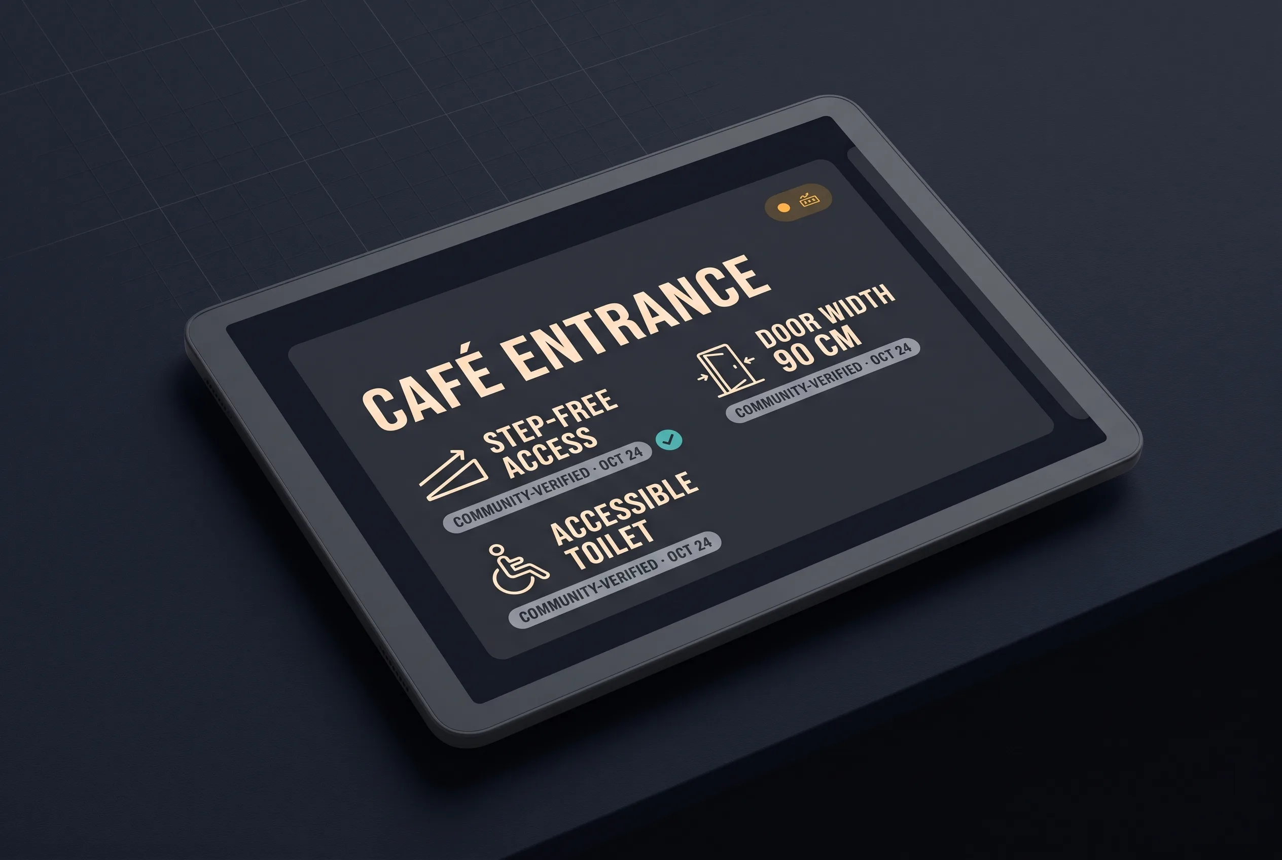
Wrong accessibility data is worse than none — it spends someone’s energy and dignity on a promise the venue can’t keep. So contributions carry provenance, not just votes:
- Every fact records who reported it, when, and how (visited in person vs. phoned ahead)
- Facts decay: an elevator confirmed two years ago is displayed as stale, not true
- Contributors who use the relevant feature (“verified by a wheelchair user, last month”) are weighted above drive-by edits, and the display says so in plain language
- Conflicts are shown as conflicts — “reported step-free in May, three steps in July” — because an honest disagreement beats a silently averaged lie
The design budget: a user should be able to judge whether to trust a venue’s data in under ten seconds, without leaving the venue card.
Screen-reader-first design
The app is built VoiceOver- and TalkBack-first: every screen is specified as a spoken interaction before it is drawn. Routes read as sequenced instructions with distances and landmarks, not as a map that happens to have labels. High-contrast and large-type modes are the default design targets, and nothing is communicated by color alone. The working rule for the team: if a flow is tedious by screen reader, it is broken — regardless of how it looks.
Why AI stays at the margins
Trust is the entire product, and generated content would poison it. There is no AI summarization of accessibility facts and no inferred “probably accessible” scoring — a model guessing about steps is precisely the failure this concept exists to end. Machine assistance is confined to unambiguous chores: reading structured details from a contributor’s photo for human confirmation, and de-duplicating venue records.
Prototype scope
One city, three data types done properly — entrances, step-free routes, restrooms — and the contribution flow with the trust model live from day one. A guide that covers one city truthfully beats one that covers a continent approximately.
Evaluation plan
- Ground-truth audit: physically verify a 100-venue sample against the app’s claims; the tolerated rate of confident-but-wrong facts is zero
- Contribution health: share of facts with in-person provenance; median staleness
- Screen-reader task completion: plan and follow a route end-to-end without sighted assistance, timed against the same task in a mainstream map app
- The question that decides everything: do users who were burned by wrong data once come back?